Buena Vista Street Model
 Mitch
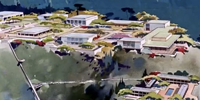
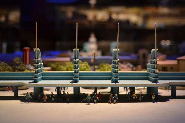
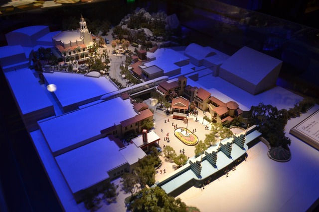
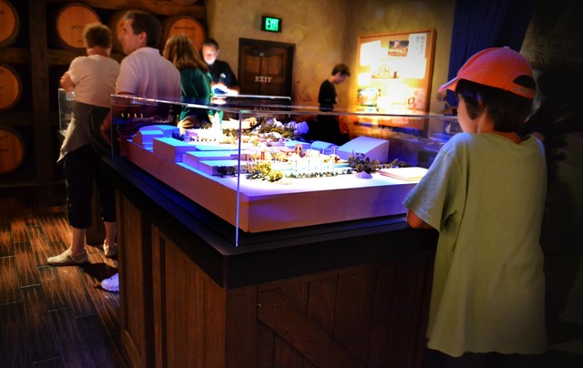
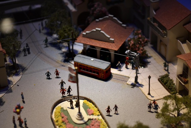
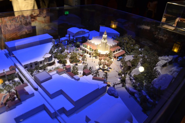
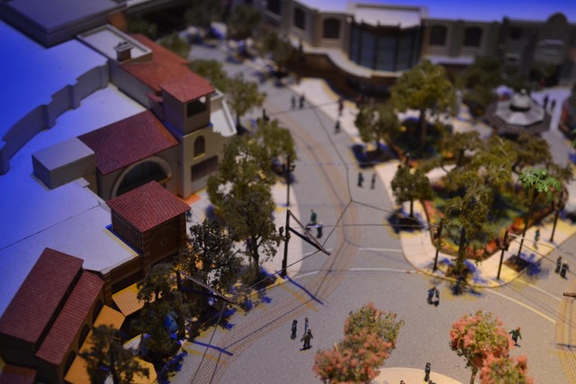
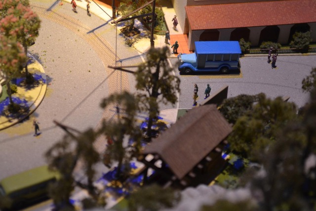
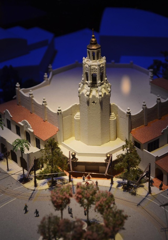
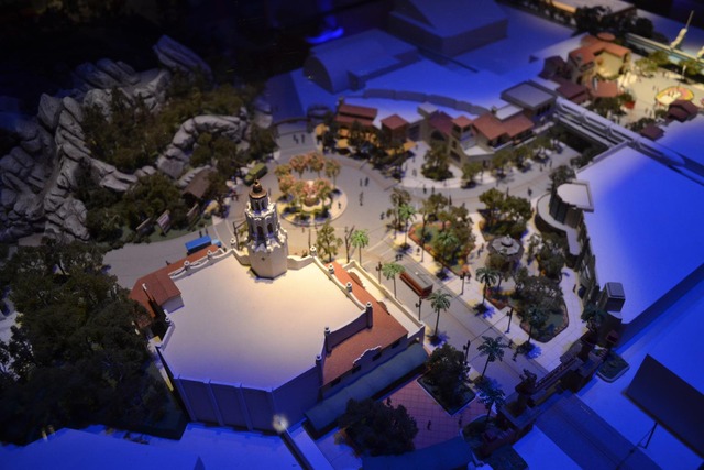
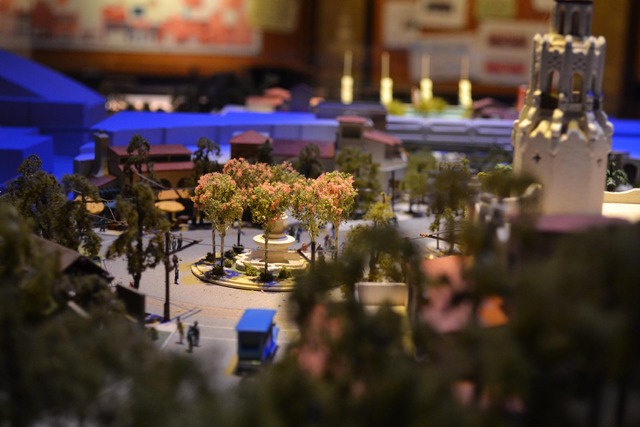
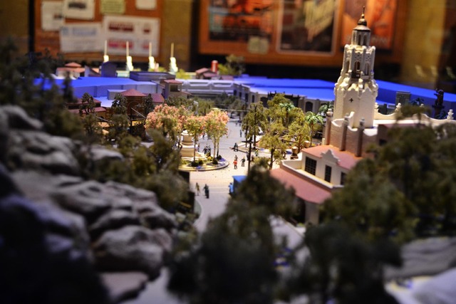
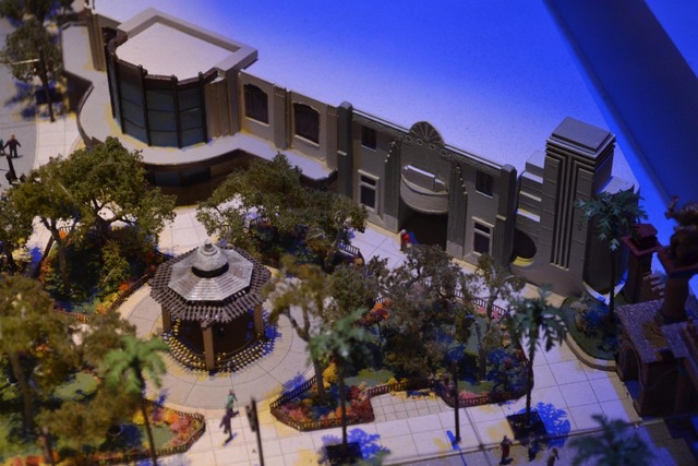
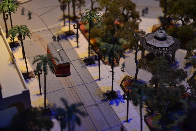
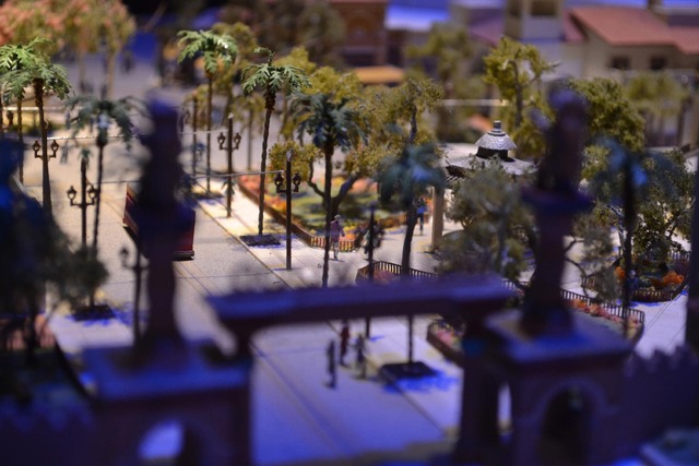
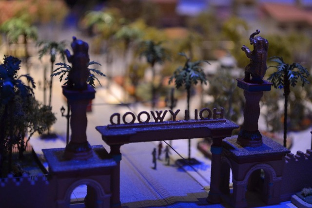
Mitch This week, while visiting the walled city of California Adventure, I took the chance to study the Buena Vista Street model. The model shows us what we can expect from DCA's upcoming new "Main Street". It looks fantastic. And compared to what was there before, it looks like the greatest park improvement in Disney history.
This is a rare occurrence. Disney takes something they originally considered to be "hip" and "attractive to the young crowd" and they spend millions to convert it to be something far more "traditional Disney". And we traditional fans should rejoice.
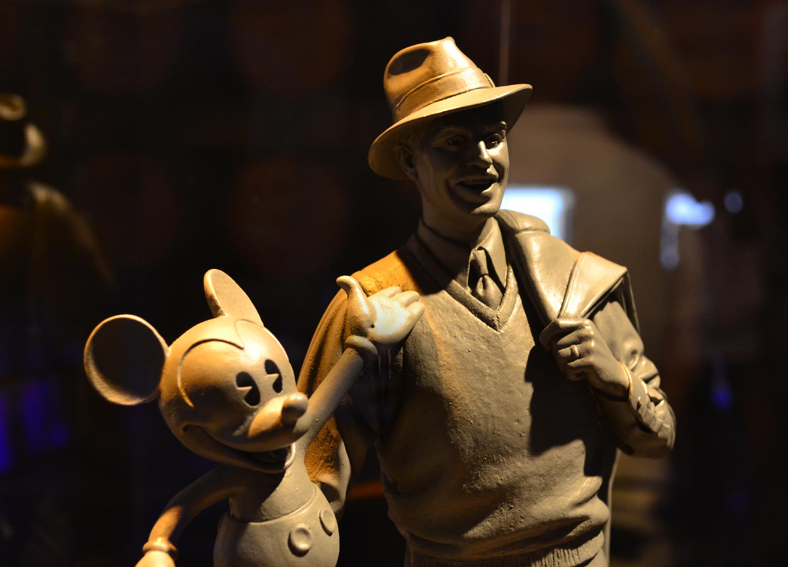
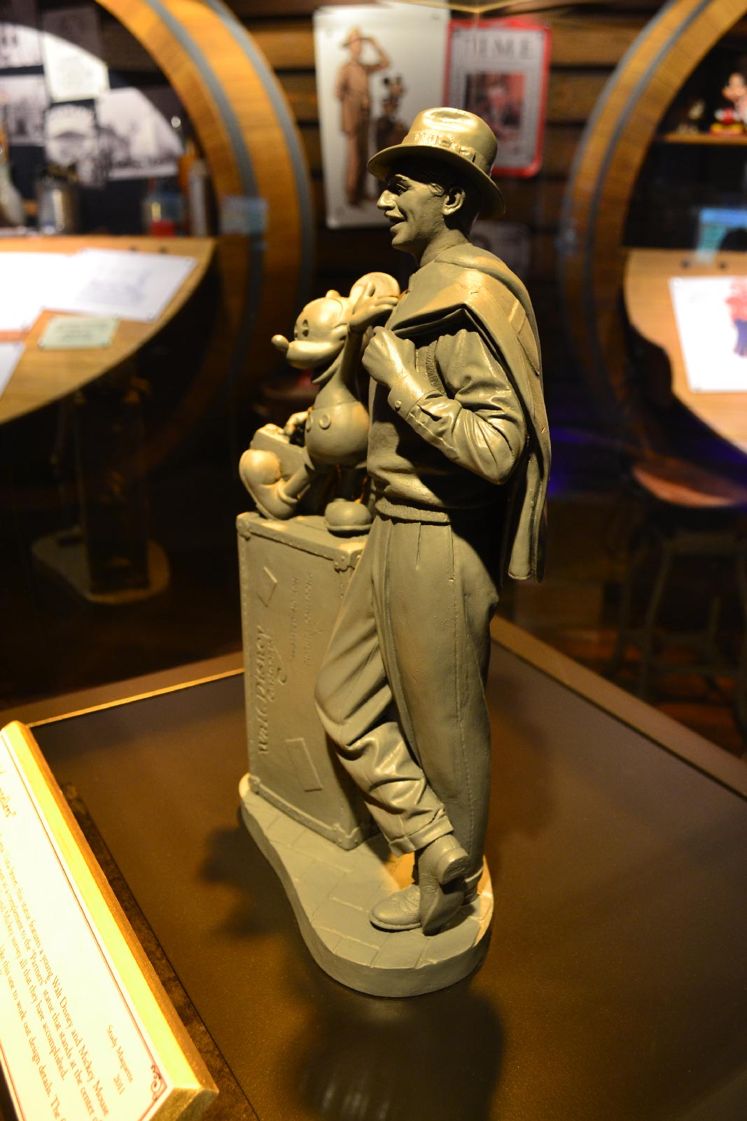
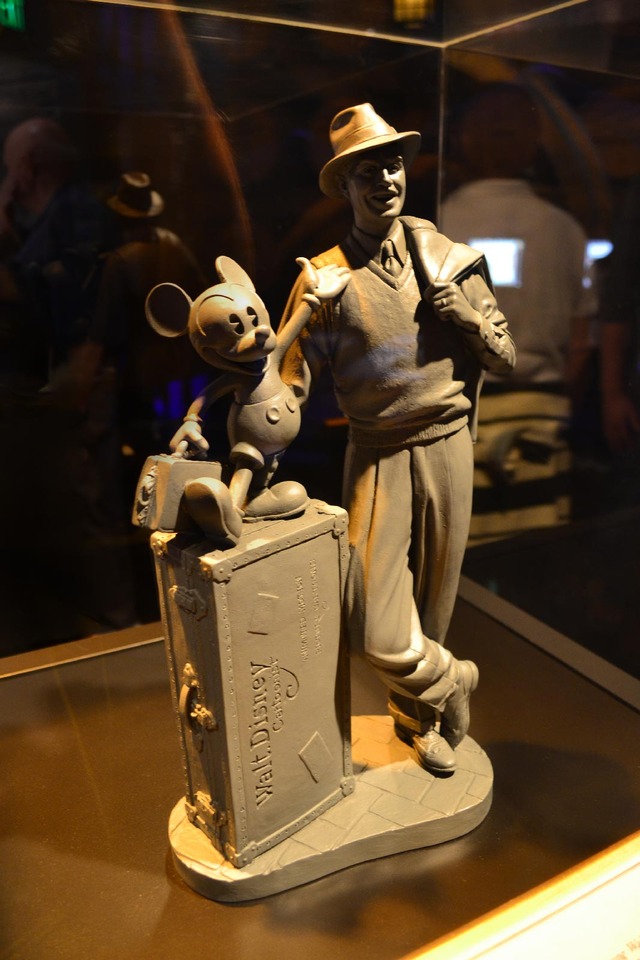
The "Storytellers" statue maquette on display was also a sight to behold. This will be the counterpart to the "Partners" statue at Disneyland. You'll notice in the fourth photo a small Walt and Mickey statue close to the front of the park. The most recent Imagineering presentations confirm that the Storytellers will be located in the mini plaza in photo 13 of this post.
Hooray California Adventure for doin' these things. I tell you, that Little Mermaid ride is also something wonderful. I loved it to death. Here's to fixing life's little mistakes.
Related posts:
Swiss Family Treehouse Model
The Wonders of Nature's Wonderland [ PART 2 ]
Disneyland 1955 Model Close-ups
A Look at the Progress City Model- Then and Now
2 Fantastic Disneyland Scale Models
LEGO Disneyland
 California Adventure,
  Scale Models















Reader Comments (10)
I AM SOOOOOOOOOOOO EXCITED ABOUT THIS!!!
Really it's a great thing. Sadly it's what should have been done in the first place. But better late than never. Also, great photos!
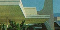
The entrance is pure Pan-Pacific Auditorium in the Fairfax District of Los Angeles
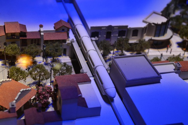
Excellent photos Mitch. The shot with the kid looking at the model is really good - hope my kids are interested in maps/models like I am someday. Also, really love the depth you got with some of those tight shots. That model looks great too - like that they put the monorail in there in "background" white (things existing/not changing). I also like how they're running the lines above the street for the trolley, keeping everything authentic. Never was able to get to v1, but can't wait to see this new rendition of the park.
Side note: Abandoning what is hip/cool in today's world (this particular decade, or whatever) for something more timeless, is advice that not only theme parks could use, but cities in general. Funny (and sad) how some cities will revamp huge areas with "contemporary" styling, hoping it will appeal to a younger, more vibrant civic base, only for it to lose its appeal after the first weekend. Continually ignoring history to their demise...which goes for rail transit in this country too, in my opinion.
Anyway, yeah Disney - great work!
As much as i like this update; I cant help but notice how badly the Monorail clashes with this very classice looking space.
This is great stuff. I wonder if they're going to somehow modify the Monorail so that its look will seem a little more fitting in 1920s California. Obviously a monorail wouldn't fit at all, and I wouldn't want them to change the Monorail entirely. There are just ways of playing with designs and colors so that while it's out of place it still feels "at home."
Very cool. I've always been a huge fan of all the "streets" in WDW parks. I think it's why I've always liked DHS, even way back in 1990.
"The entrance is pure Pan-Pacific Auditorium in the Fairfax District of Los Angeles"
Yes, the same inspiration for the almost identical entrance to Disney's Hollywood Studios that has been in place for more than 20 years.
This one is really cool. I like the bullet train model at the center. Loving this Buena Vista Street on a table. You did a great job with the photos.
Wow! i got very impressed when i discovered this thread post and generally about this Website!!!
I love this robot made out of clay!
Excellent job guys! :-)